helping an e-commerce leader own their name
Where the brand started twenty years ago as an online book seller, bol.com has grown into a platform on which electronics, furniture, accessories, clothing and even cosmetics are sold. It has become the biggest online retailer in the Netherlands and Belgium.
Re-design the identity of this undisputed Dutch market leader in online retail. We were asked to retain ‘the good’ and to change what is needed to achieve a more human, sympathetic and contemporary look that fits better with the current position that bol.com now occupies.
22 million presents
The identity of bol.com has not changed much over the years, and as a result it was not easy for various product groups to match the brand with the inspiring shopping experience that the modern online shopper increasingly needs. It was therefore time to adjust the visual style of bol.com so that the brand can communicate inspiringly in the various retail worlds in which it operates. Over the course of two years we helped transform all aspects of their communication from tone of voice to photography, from online to offline.
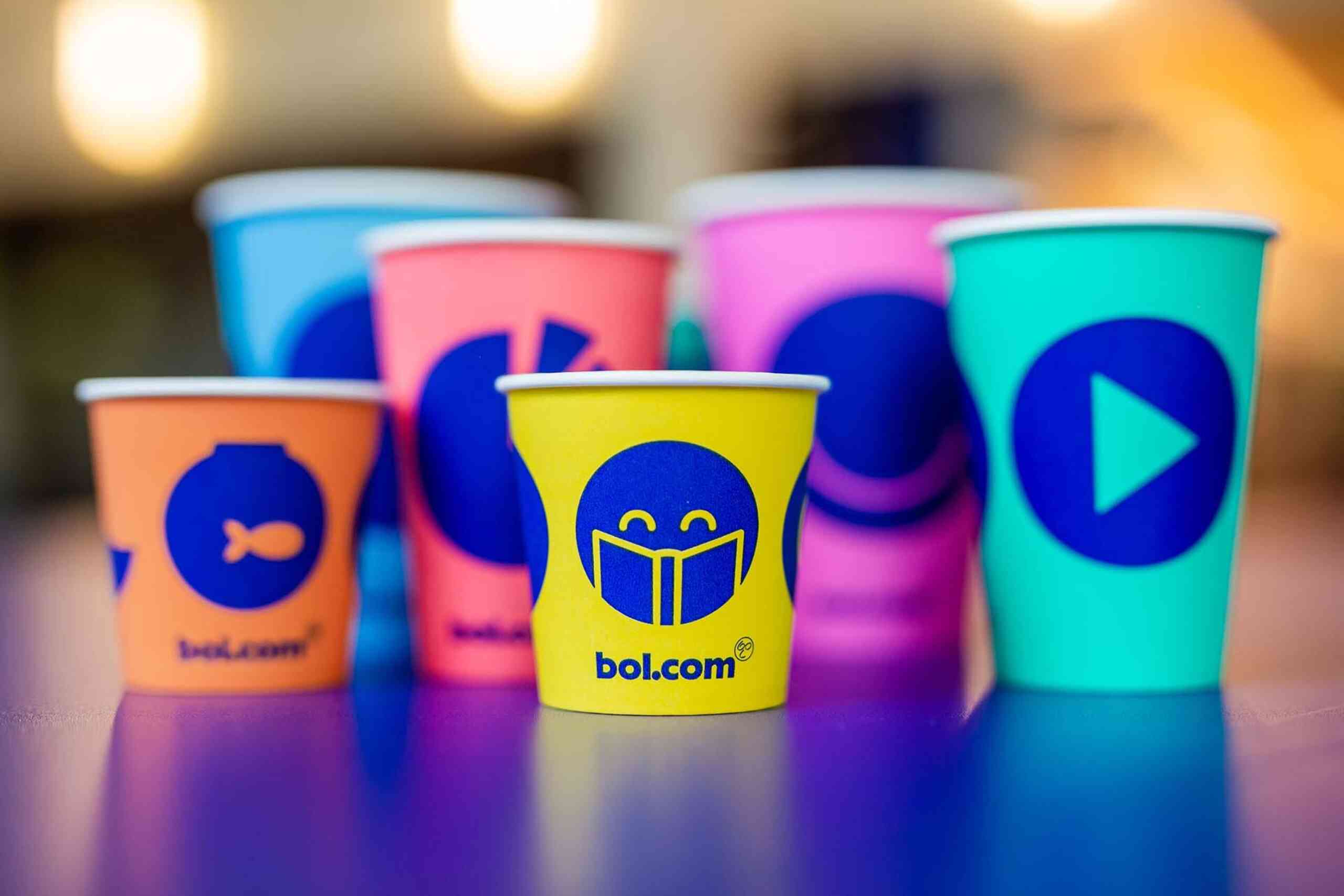
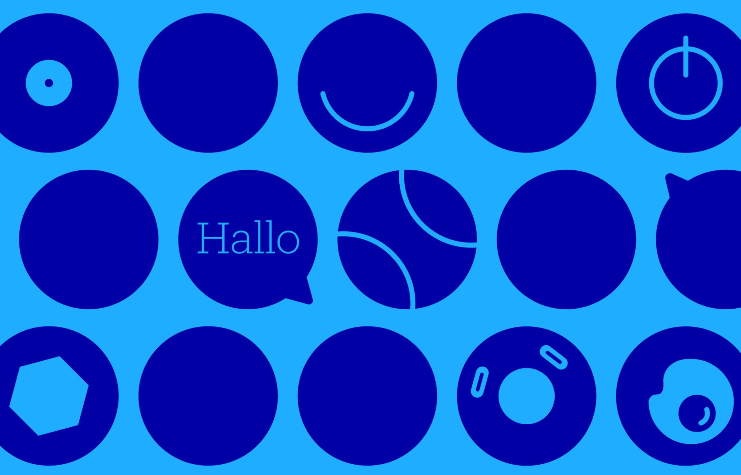
Bol.com is blue
Historically, bol.com is round and blue. Dietwee did not want to change that. A new colour blue, which is fresh, modern and stands out much more, is complemented by a new palette of bright colours. Giving bol.com the flexibility to communicate to everyone whilst staying true to his heritage.
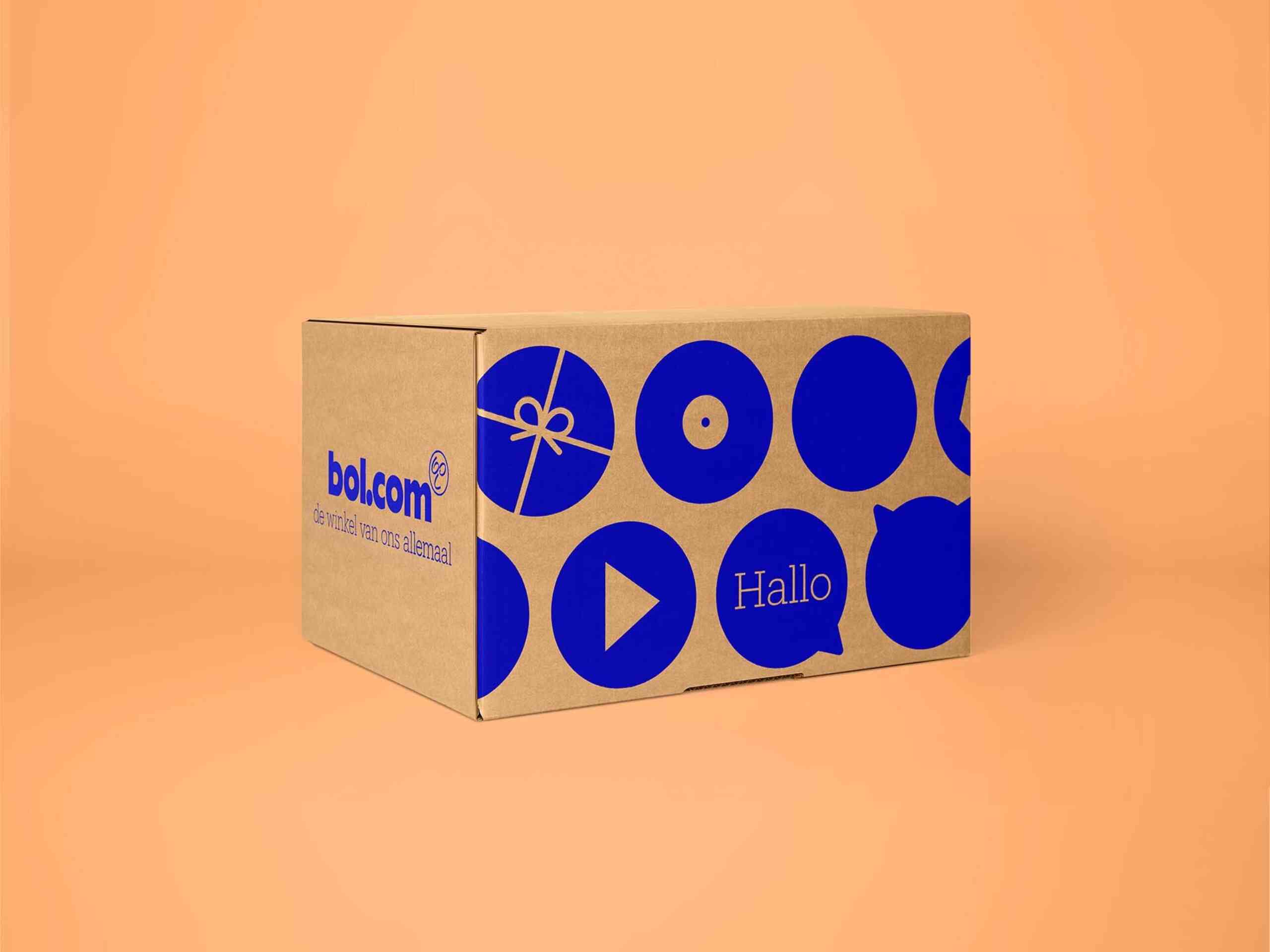
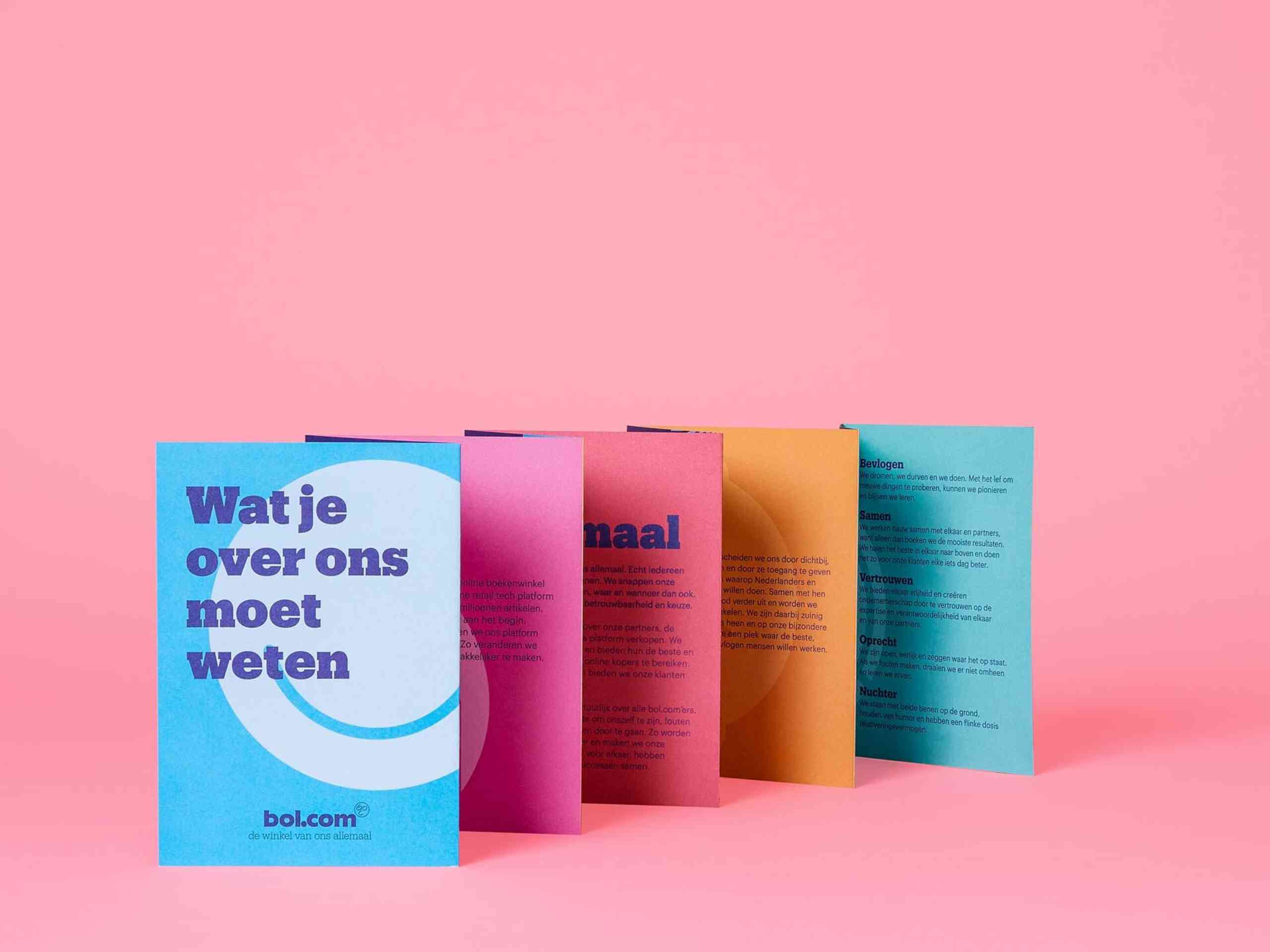
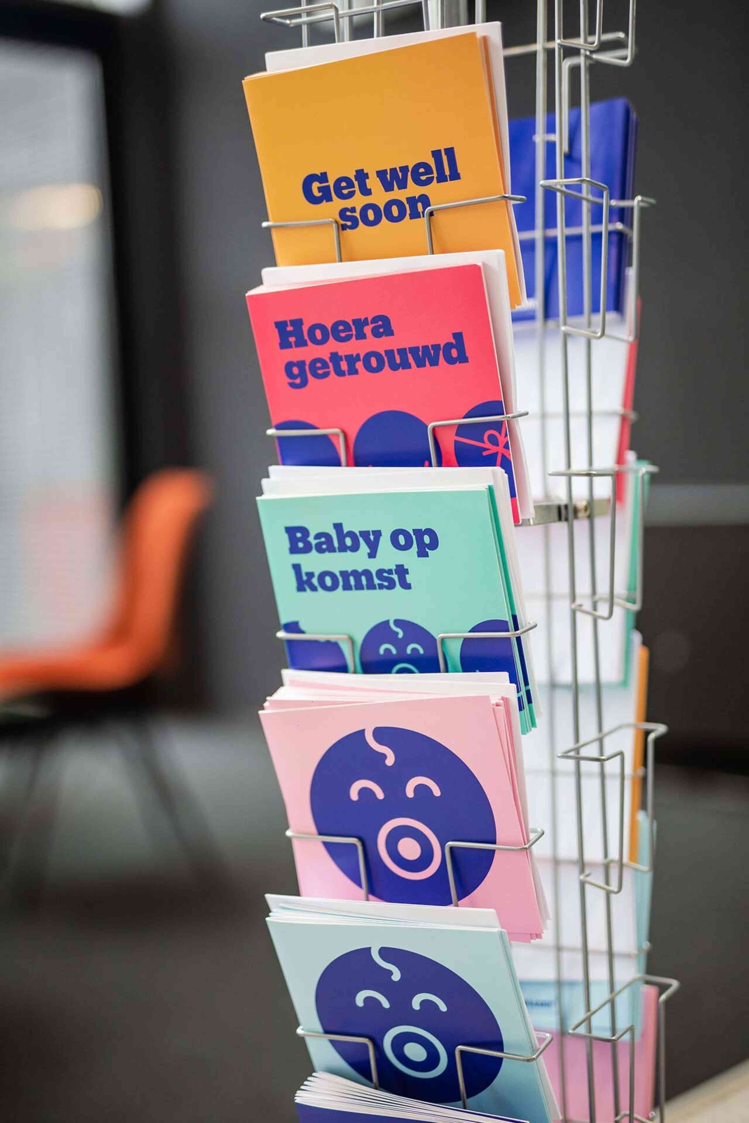
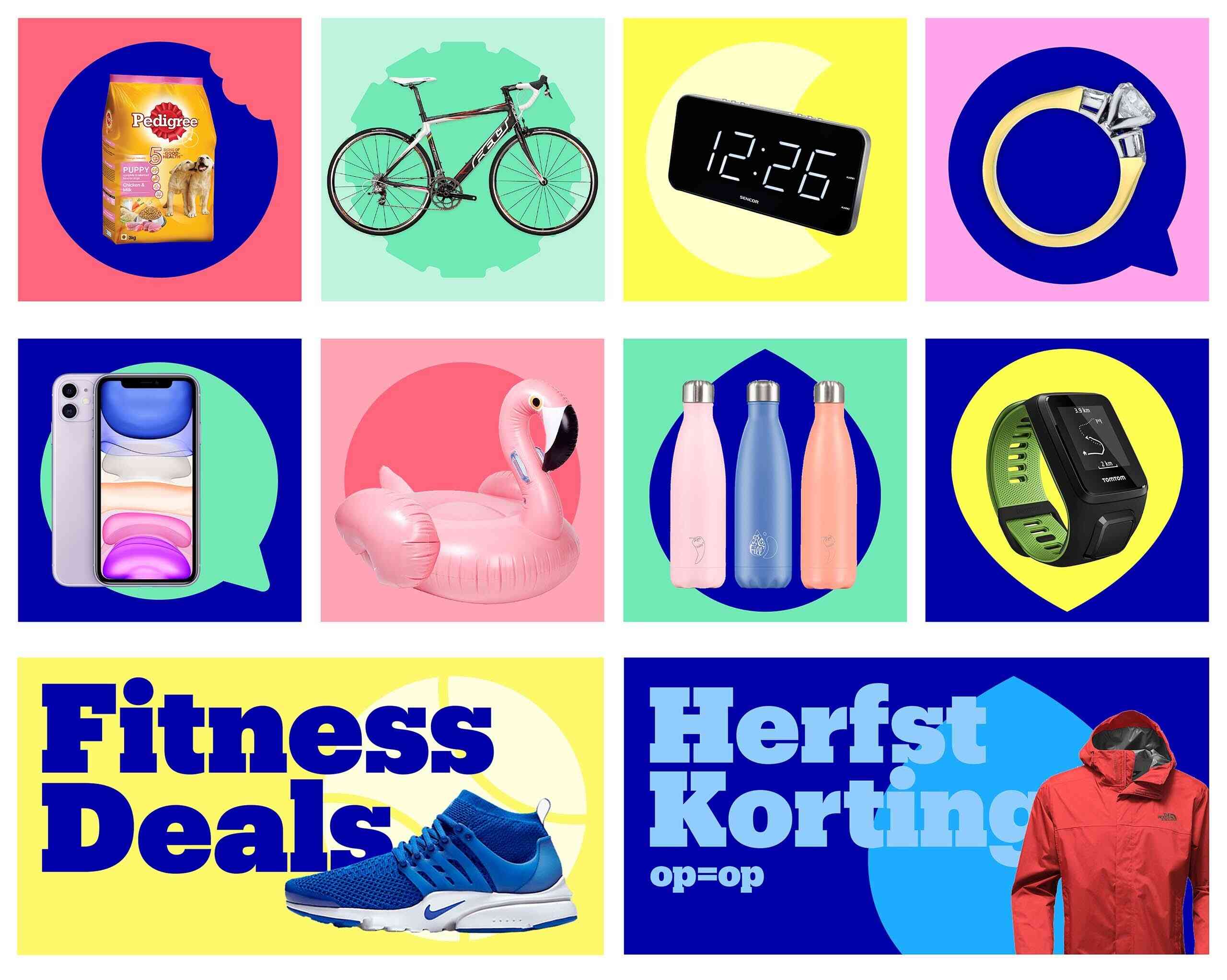
Bol.com is round
'Bol' means 'round' in Dutch. As round is in the name, the circle became an essential part of the new visual identity. We designed a unique circular icon for many categories of products available on bol.com. These could then be used in patterns and along side products to visually communicate the immense choice available.
The circle comes back quite emphatically in the form language we have developed, but you also see round shapes in the letters of the new chosen typography.
As well as creating original photography, bol.com needs to work with lots of third party imagery. We created a system that allows bol.com to combine their icons with this imagery to keep their brand style alive in all communication.
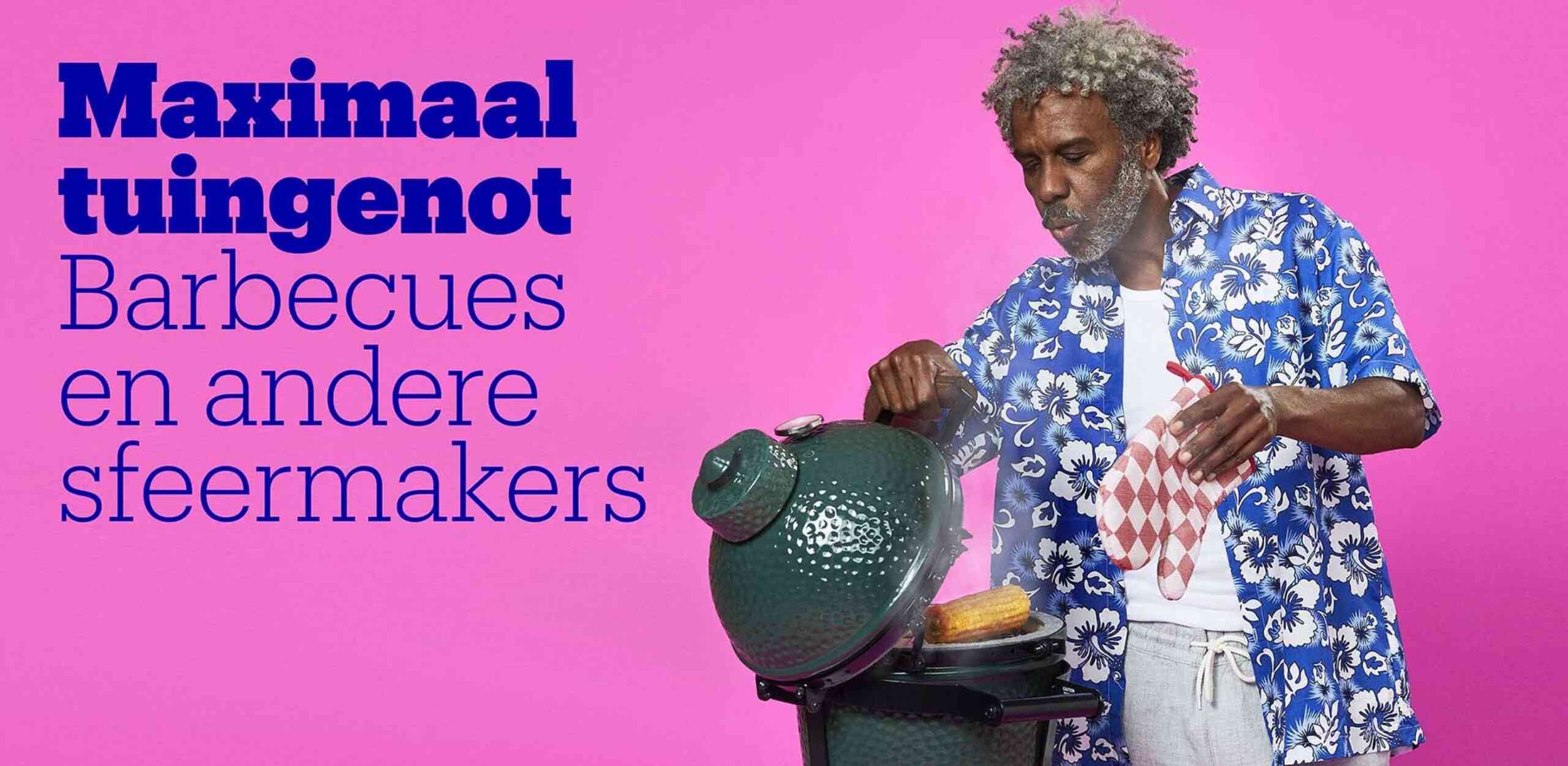
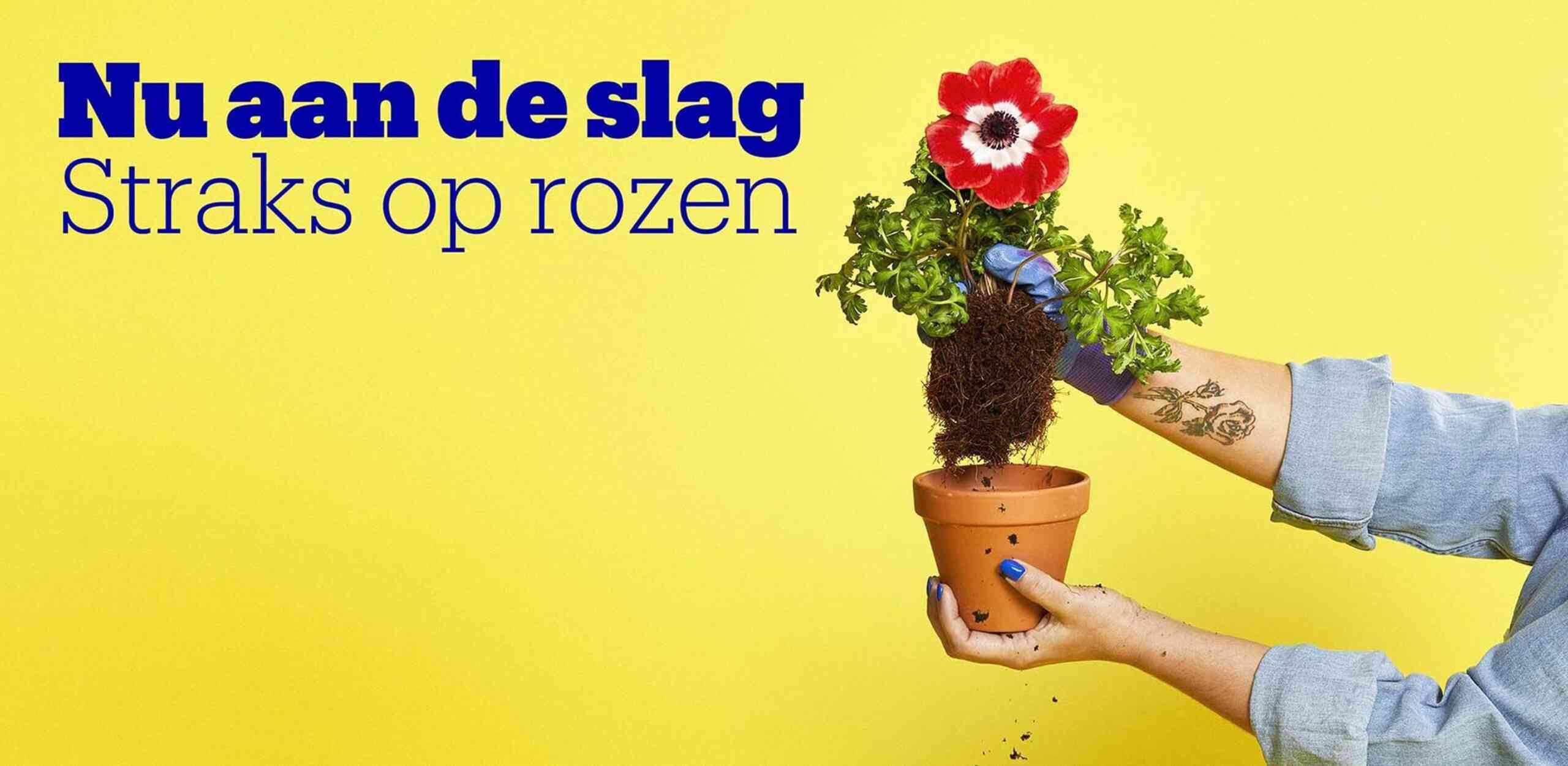
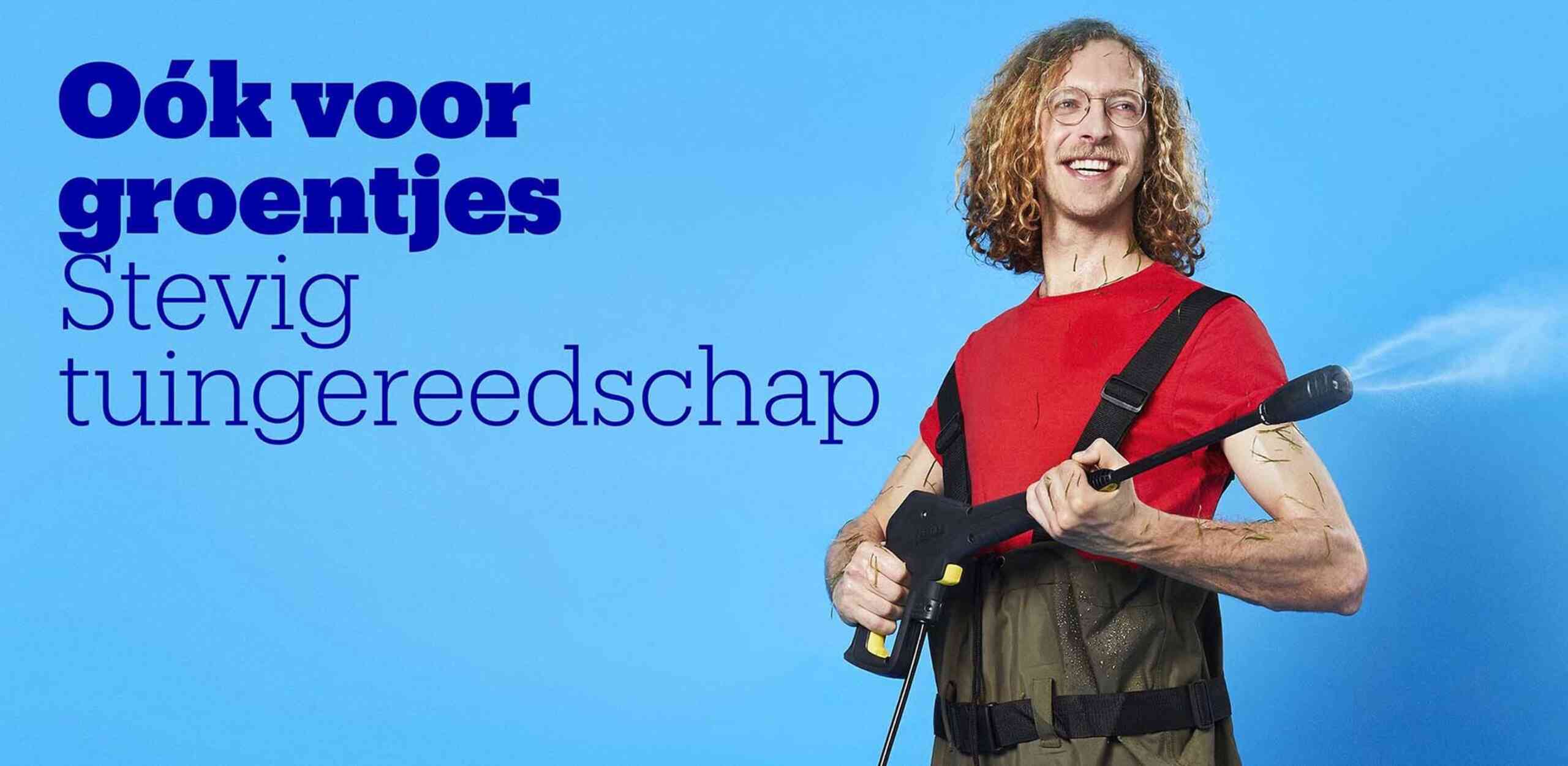
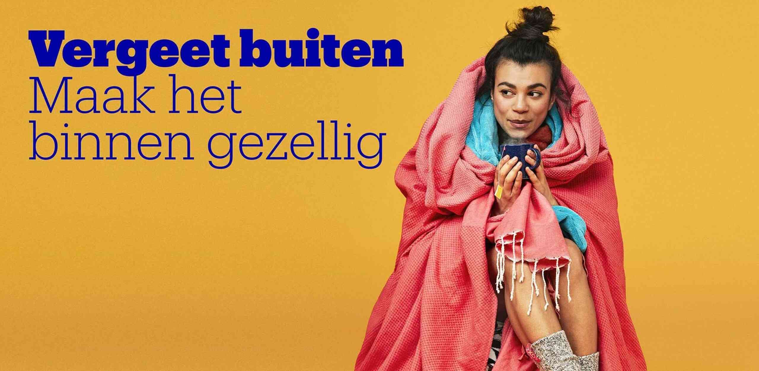
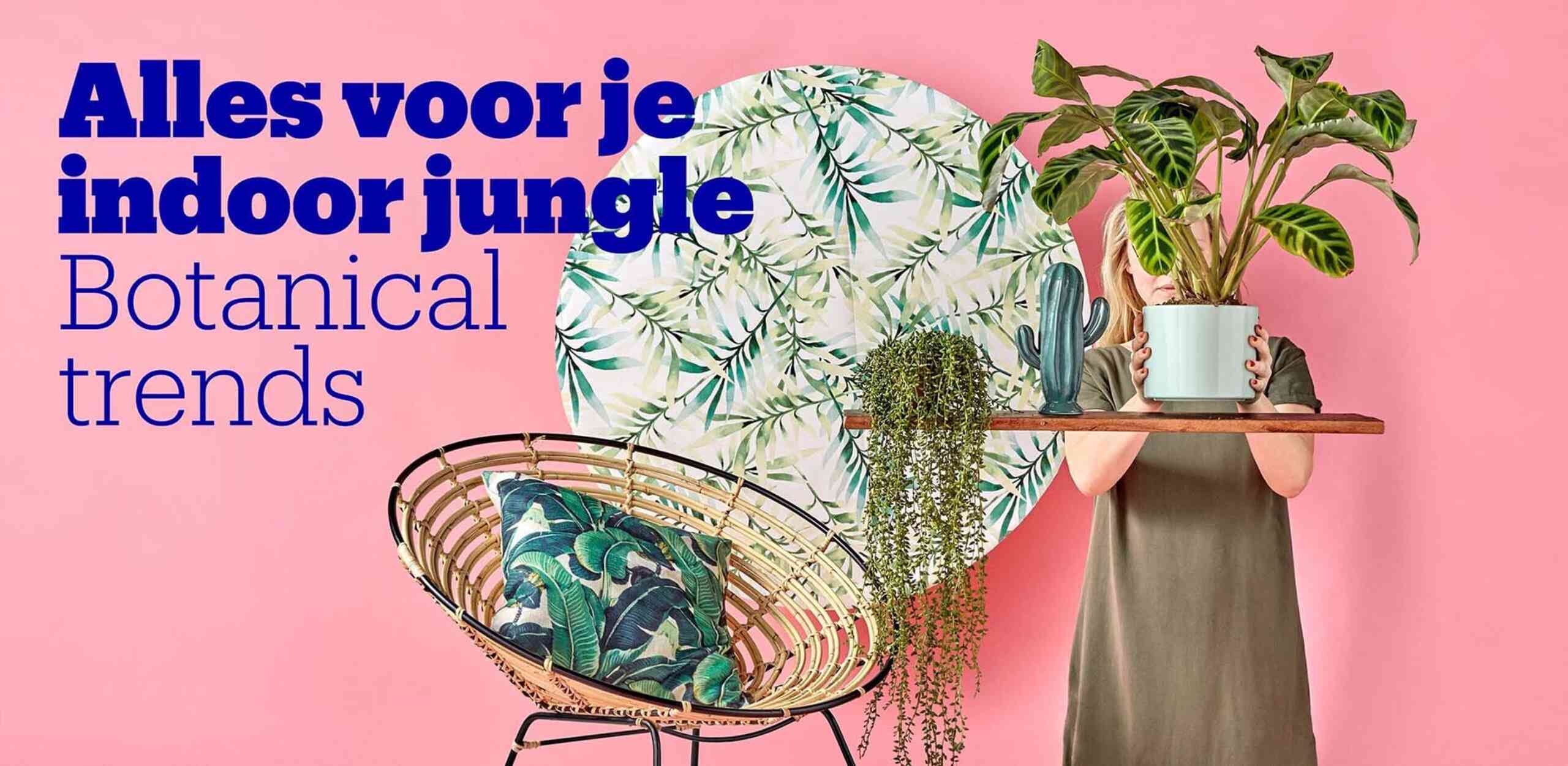
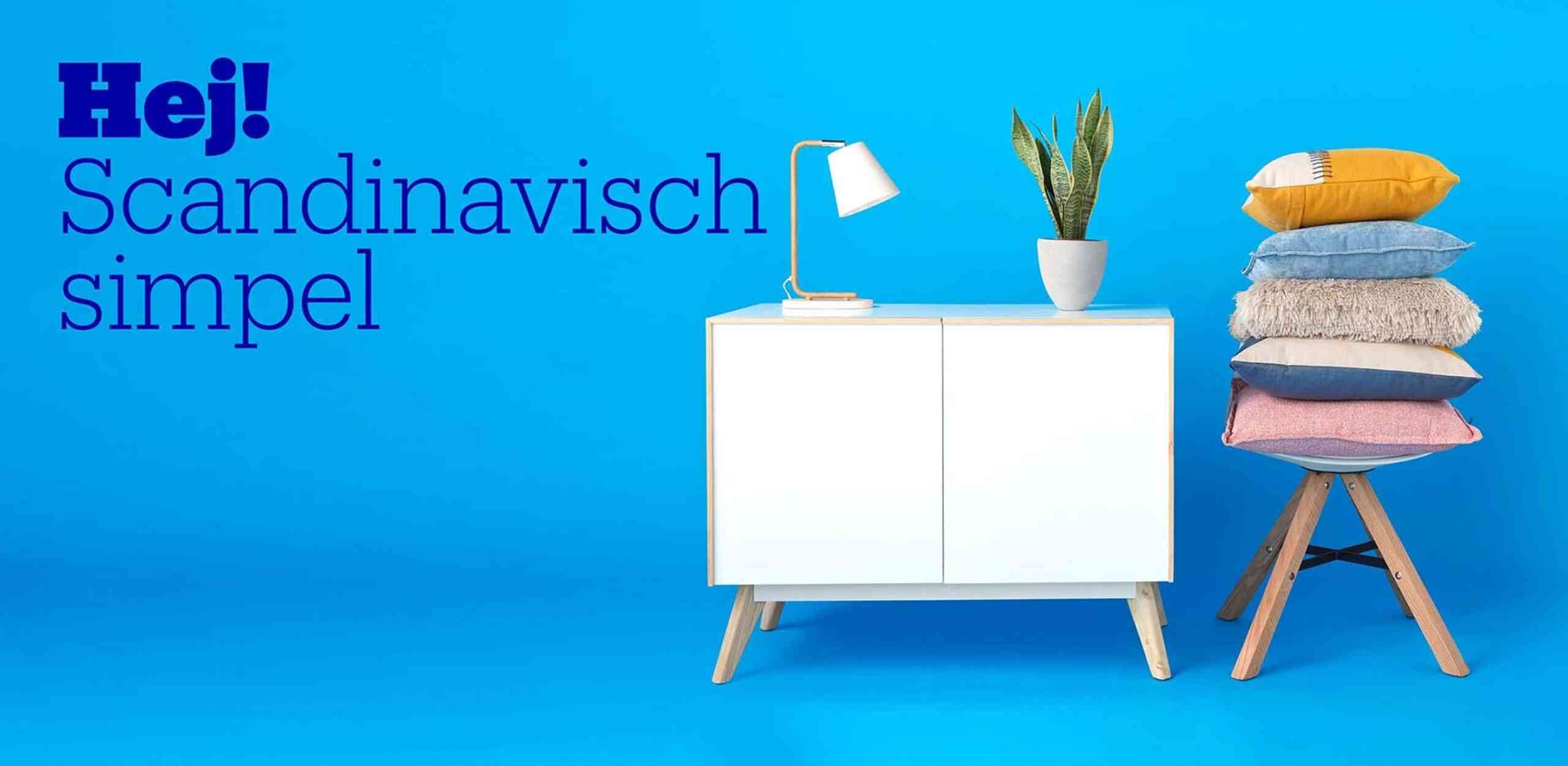
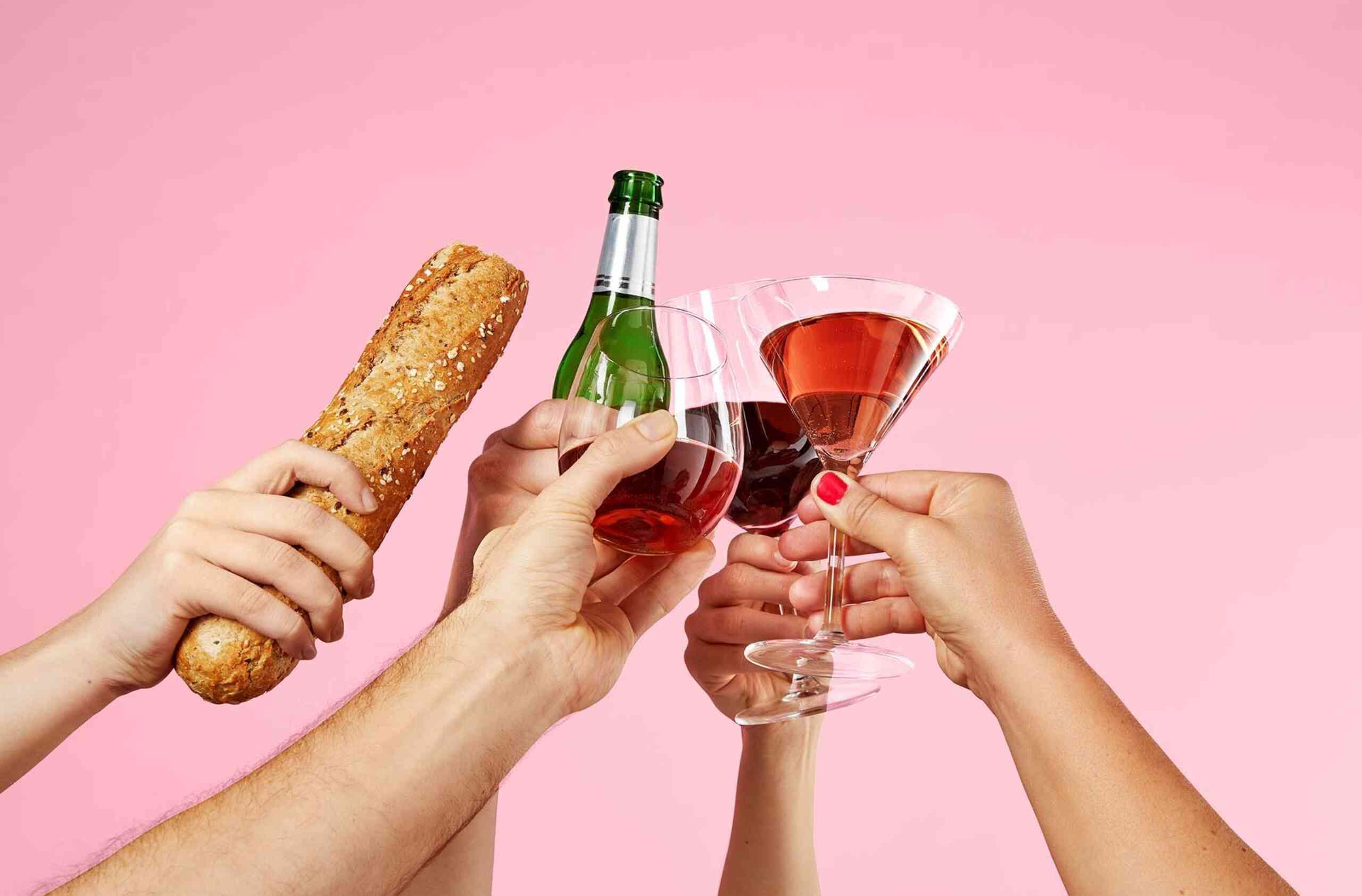
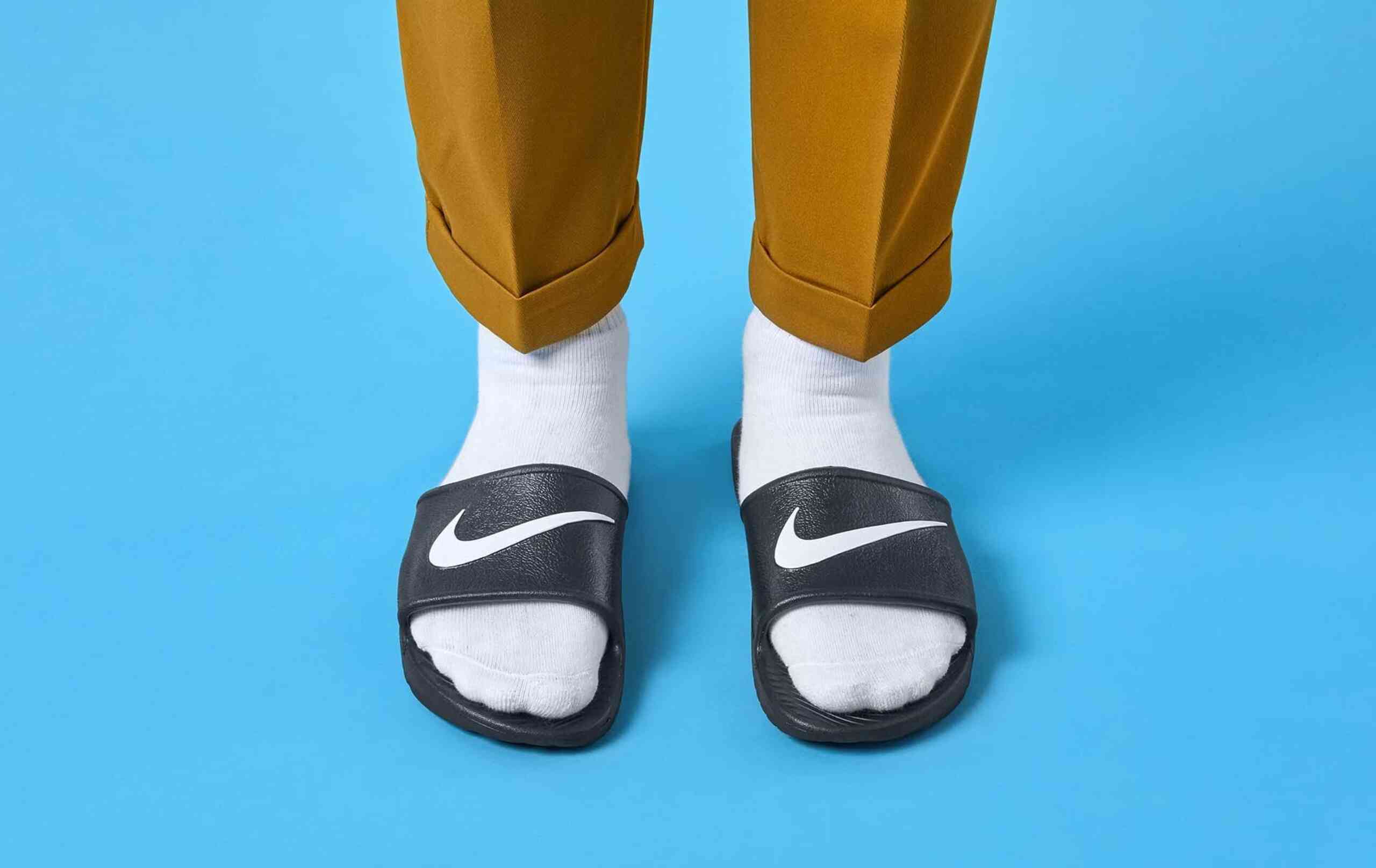
New photography style
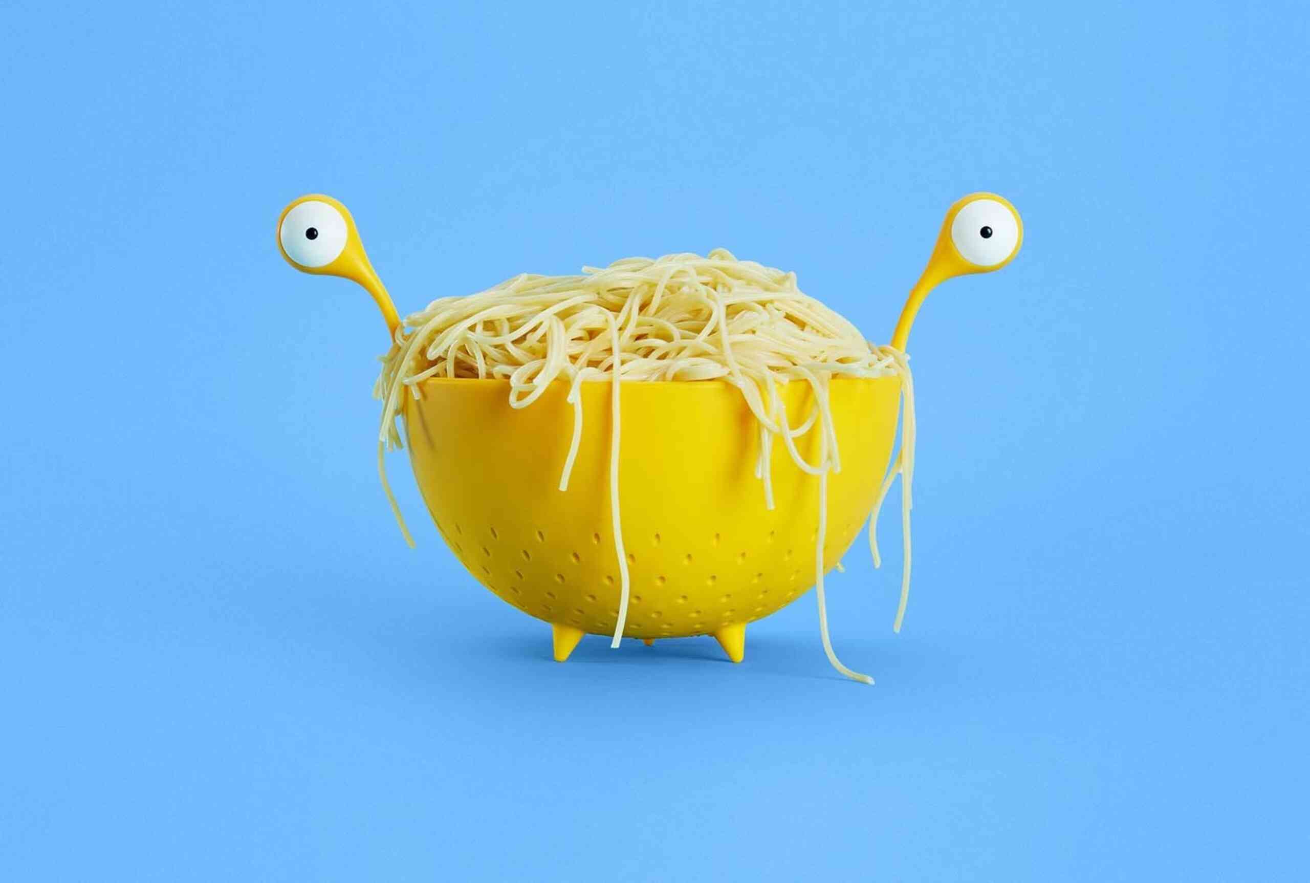
We worked closely with the bol.com photography team to develop a new style for their original content. The new photography provides inspiration and expression for the brand and, where possible, also flirts with circular shapes. The photos provide a better mix between people and products and, playfulness is added to the photos. The images are content led and, together with the right copy, the campaign images tell simple and short stories.

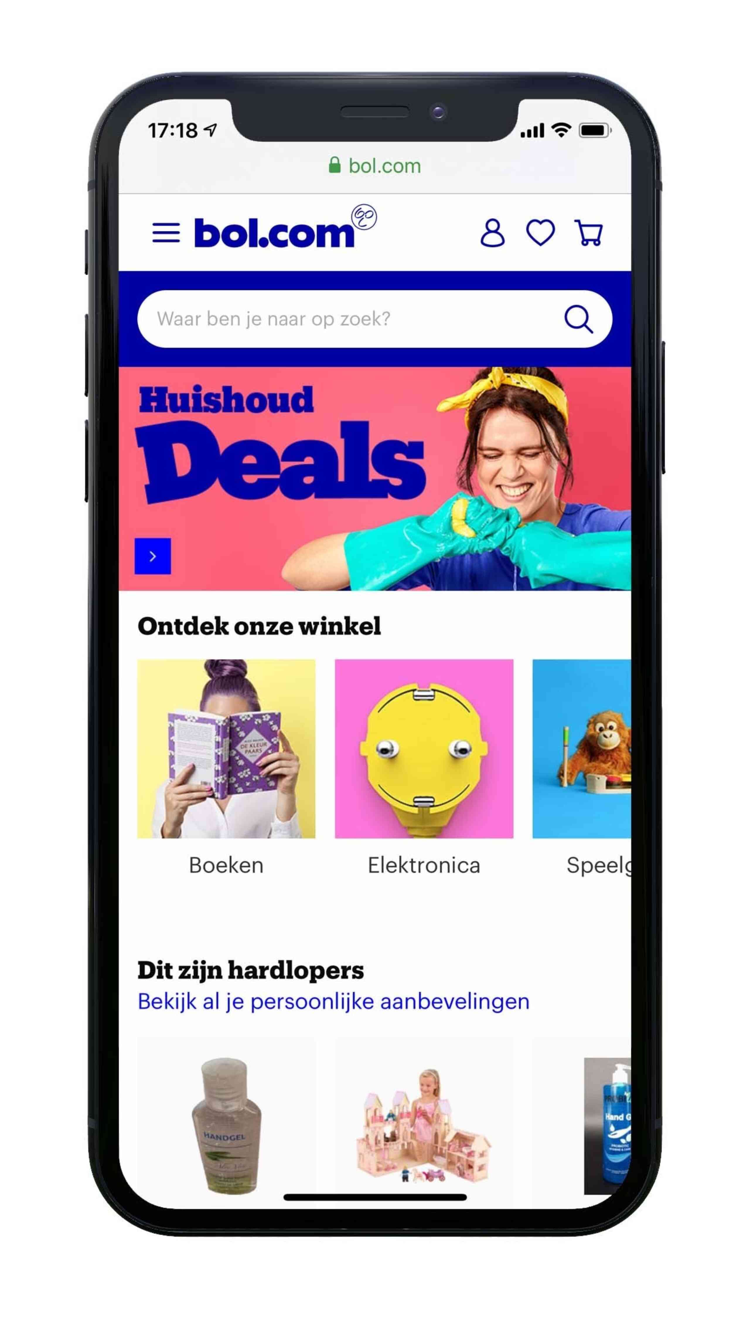
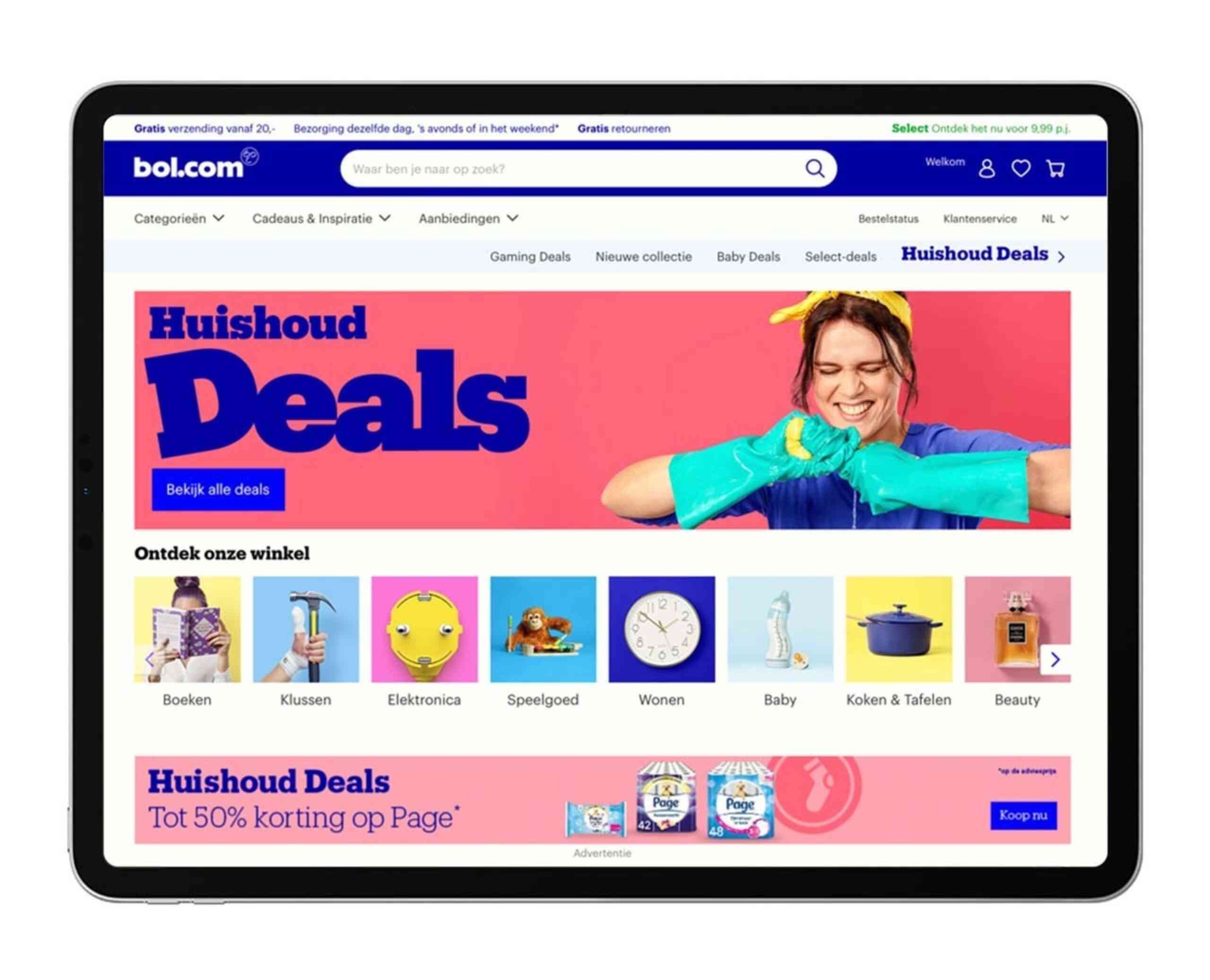
Digital
In the online environment we created more space for inspiration and branding. On all levels we added more expression, so online shopping adds to the brand experience. Together with a clear navigation and communicative content bol.com is ready for the next area.
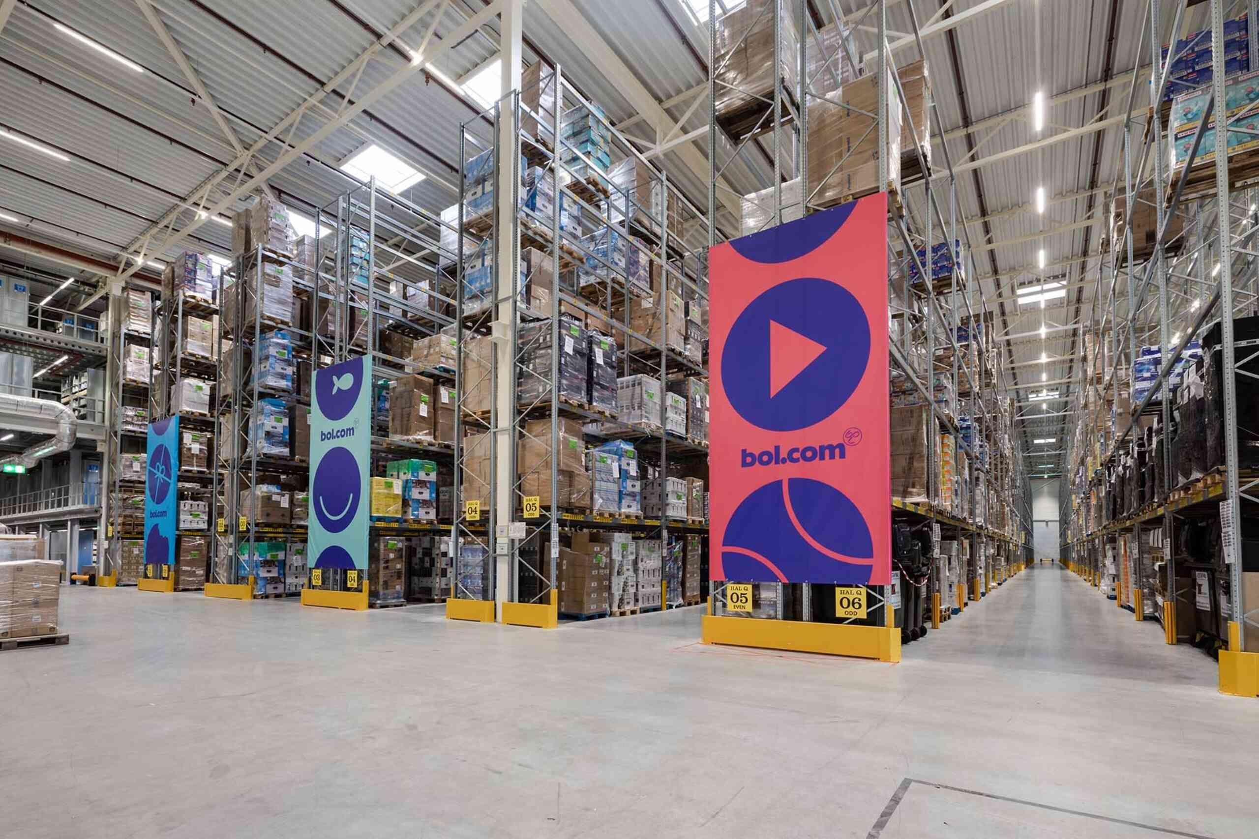
Offline
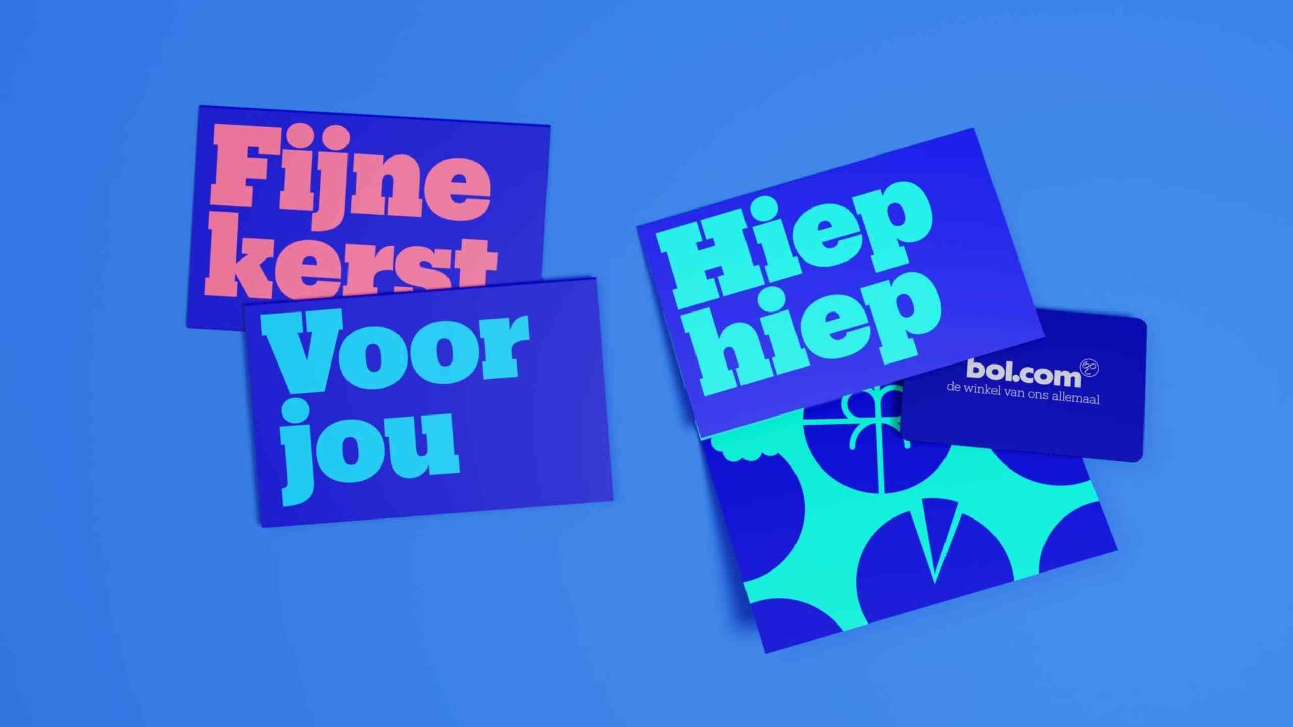
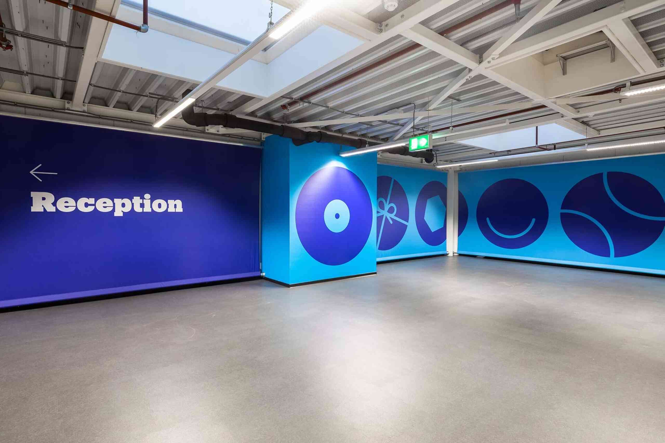
Besides creating a new identity for their online shop we also created offline items like packaging, brochures, interior and the bol.com giftcards. Also here we used the circular form language to create a unique and recognizable pattern. The combination of the different icons reflects the wide range of products available at bol.com.