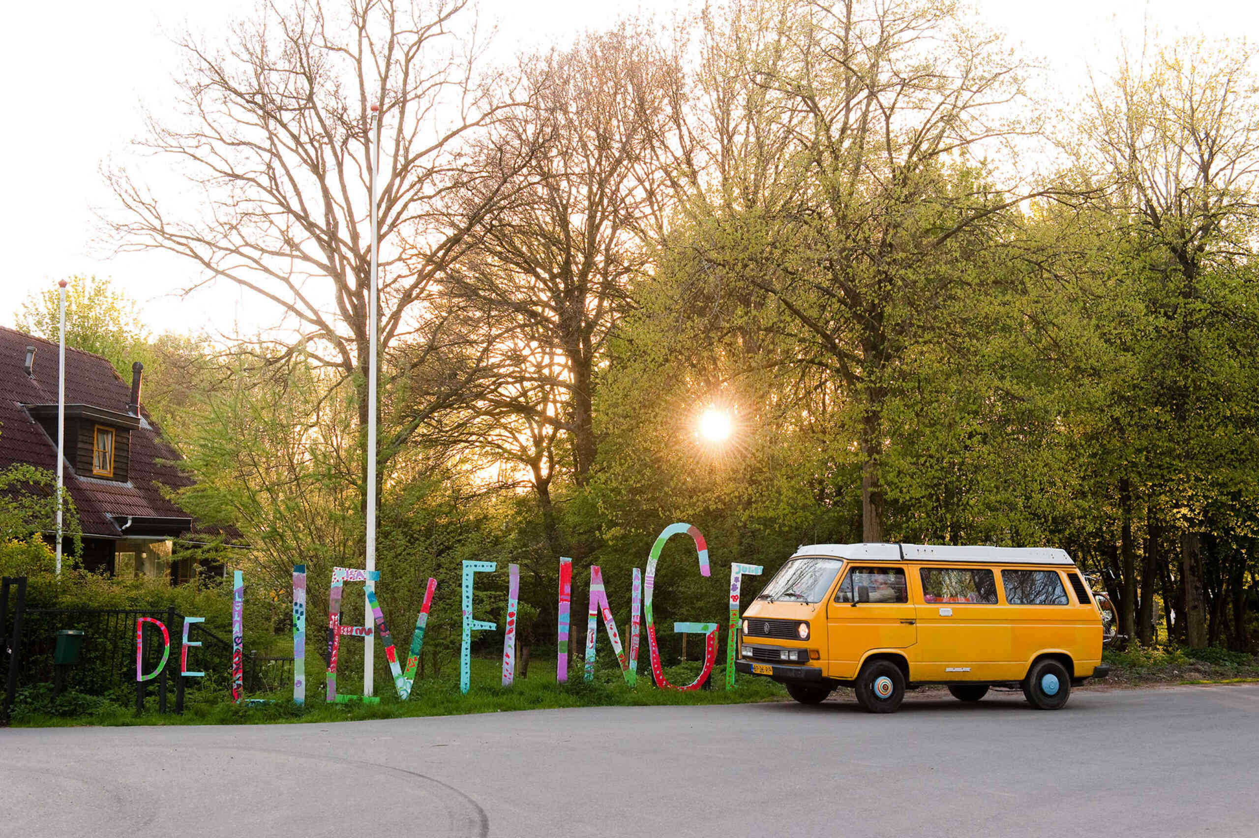
Lievelinge: a camping experience redefined
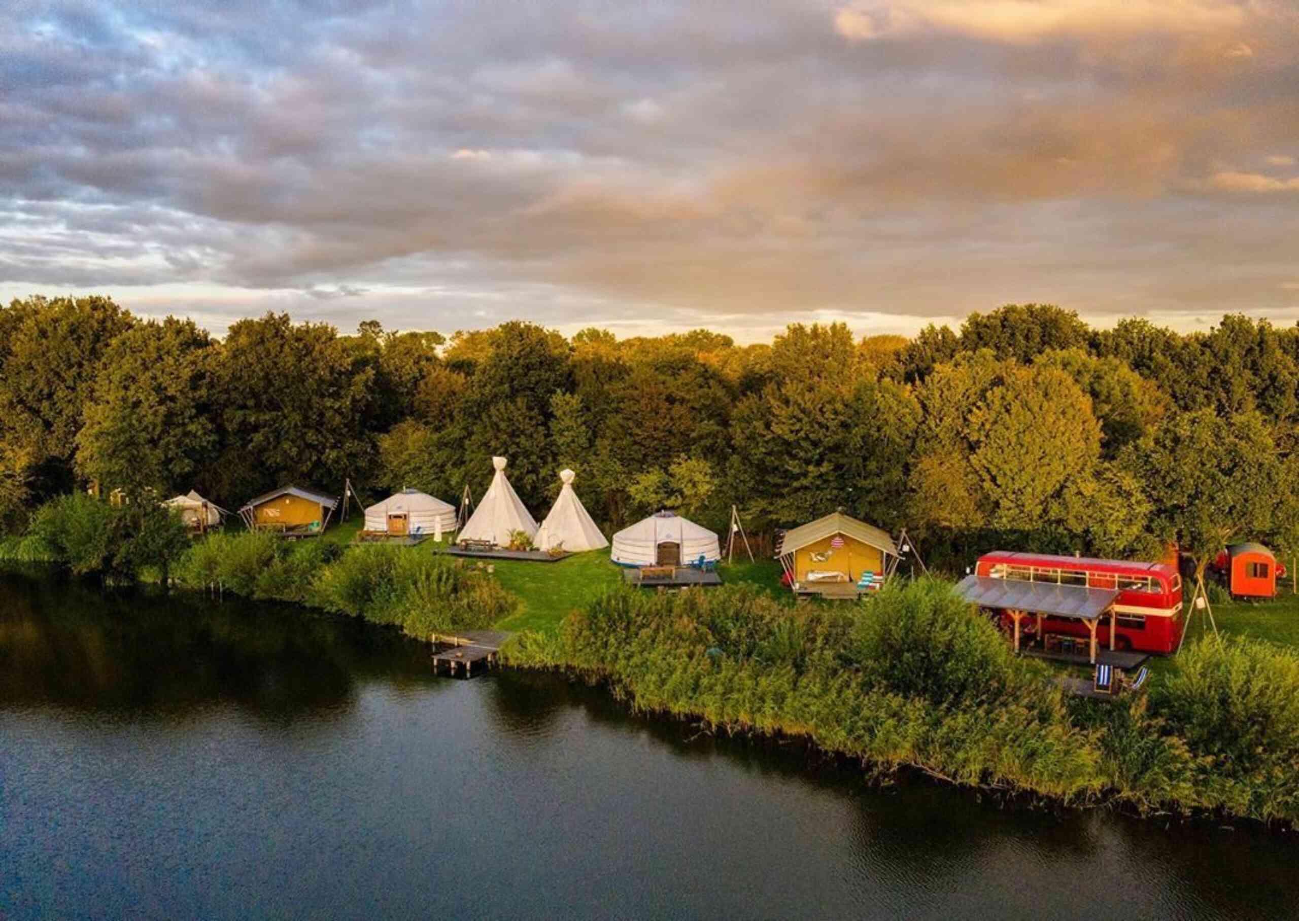
One of the strongest love-brands we are involved in is the Lievelinge for whom we redesigned the identity and build a new website last year. The Lievelinge is a campsite redefined: a marvelous biotope and playground. The ideal oasis to get away from it all.
Share the love
What if? And why not? A campsite? A fair ground? A makers space to call your home? An open creative community? A permanent festival? A free haven? The perfect wedding location? A playground for children of all ages? Sometimes all of the above and sometimes much more.
Its founders imagined that if they would invest their love and creativity, it would attract people to do the same and generate more love and creativity. And it worked. The result really is the most loving place you can imagine.
Dietwee has the pleasure and honor to be co-founder in this collaboration of eight creative entrepreneurial friends. Their Lievelinge is a camping ground redefined… a new freedom formula: a favourite place. A fertile green and flowered oasis in the middle of the Netherlands, calling upon you to let your guard down and open up to the infinite yes. Children of all ages can open their senses, free their mind, dream, meditate, wander, get lost, go on an adventure, improvise, come dance and play at the little Lievelinge paradise.
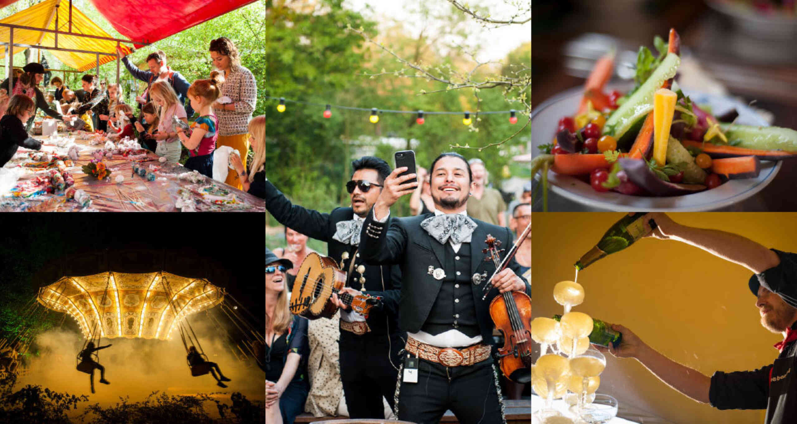
A lovely lesson in co-creation
The Lievelinge from the start is a place where many creatives bring, share and mix their art and music and creative talents, often leading to beautiful new creations. By mixing, editing, composing, performing, re-using, restyling and blending everyone co-creates often resulting in marvellous decorations, music, interiors, theatre, and much more.
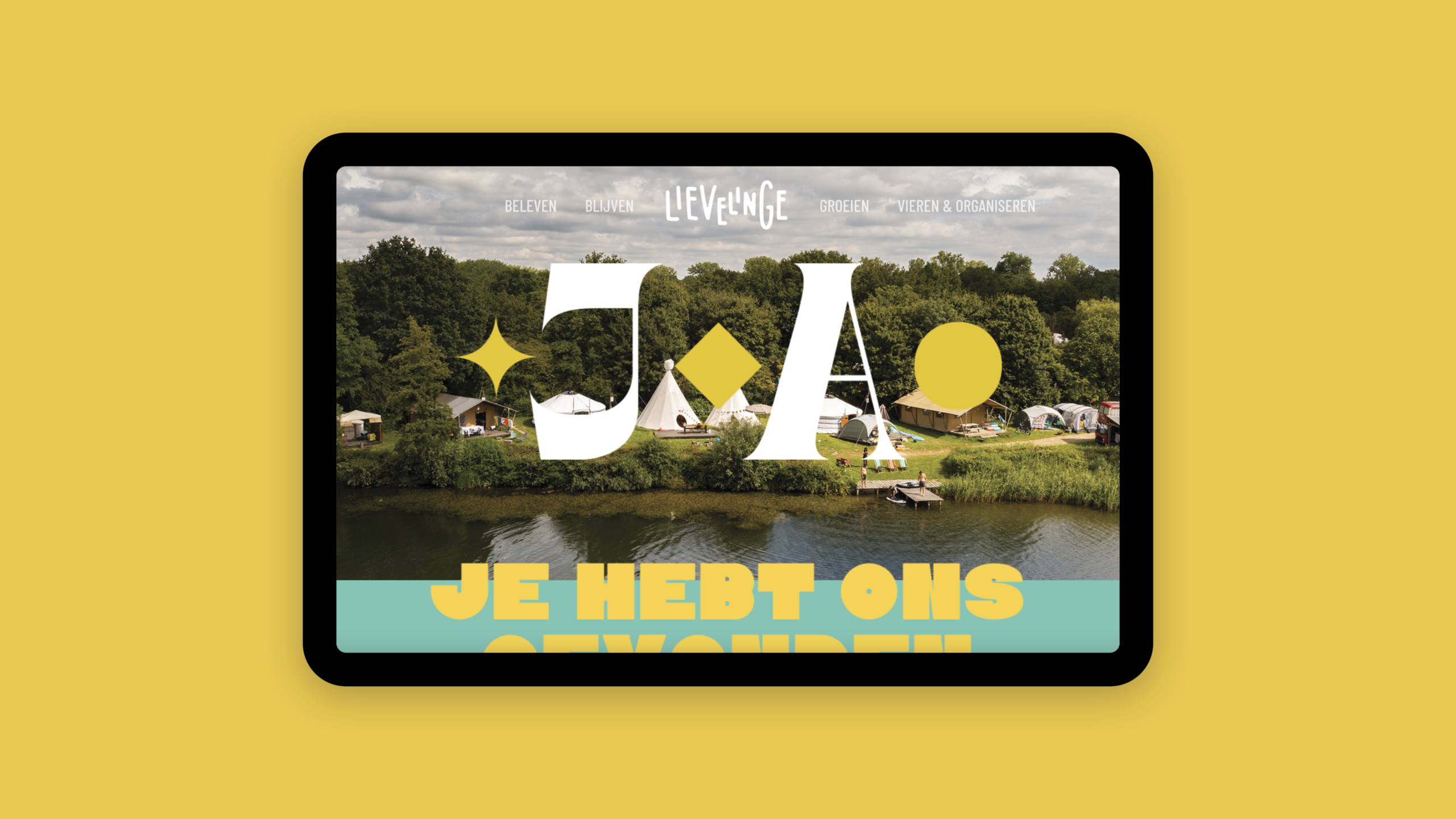
Ten years ago we designed the logo and identity for the Lievelinge. A characteristic self-drawn handwriting style font, style and set of colours which formed a playful anti statement at the time. Over the years we were amazed how the informal style was imitated or at least ‘also used’ not only by other campsites and restaurants, but also camping books and even holidayparks. In the meantime, Arlette, the resident Lievelinge art director who totally masters sign writing, and painting, adapted the identity in her day-to-day use of signs, flyers and newsletters over the years, gradually adding colours and fonts to serve her purpose as she saw fit.
When it was time to redesign the website and identity Dietwee’s designers thought that the handwritten marker version Arlette derived from the logo for use on blackboards and signs could be a nice starting point to base the new identity on. We enriched that renewed logo with an updated set of fonts and colours – honouring the circus- and retro-festival-feel which the Lievelinge loves to play with in their decors and programming – but then transported to the digital age.
Hence a set of digital wood type and printing press inspired (yet contemporary) fonts were combined and blended with the logo and style Arlette had reacted upon from our original identity, which we then in our turn adapted and restyled to the logo and identity as it is now. For us it was an inspiring new way of co-creation in its purest form, celebrating our different views and approaches and using that as a strength. The result is a playful, authentic, and rich style, sometimes wild and chaotic, sometimes calm and laid back, fitting the many moods Lievelinge can be and convey.