New identity School for Human Leadership
Sixteen years after we designed the previous identity for leadership training institute vanHarte&Lingsma, where the ampersand sign (&) formed a heart as their bold logo, the company's new leadership wanted to refresh their identity and renew their communication. After having spoken with many agencies without feeling truly understood they decided to call us and lucky for us it was an instant click...or maybe you could even say 'love at first sight'!
We started this challenge with investigating and defining the brand's purpose, new positioning and manifesto. Together with our long time partner Fleur Greebe (Different Company) and the vanHarte&Lingsma team we first started with several inspiring sessions to create a clear new brand positioning and brand manifesto.
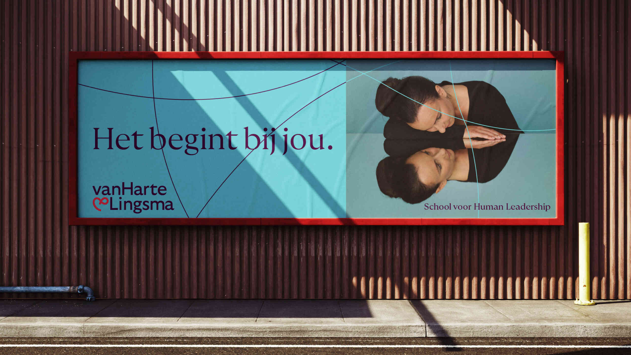
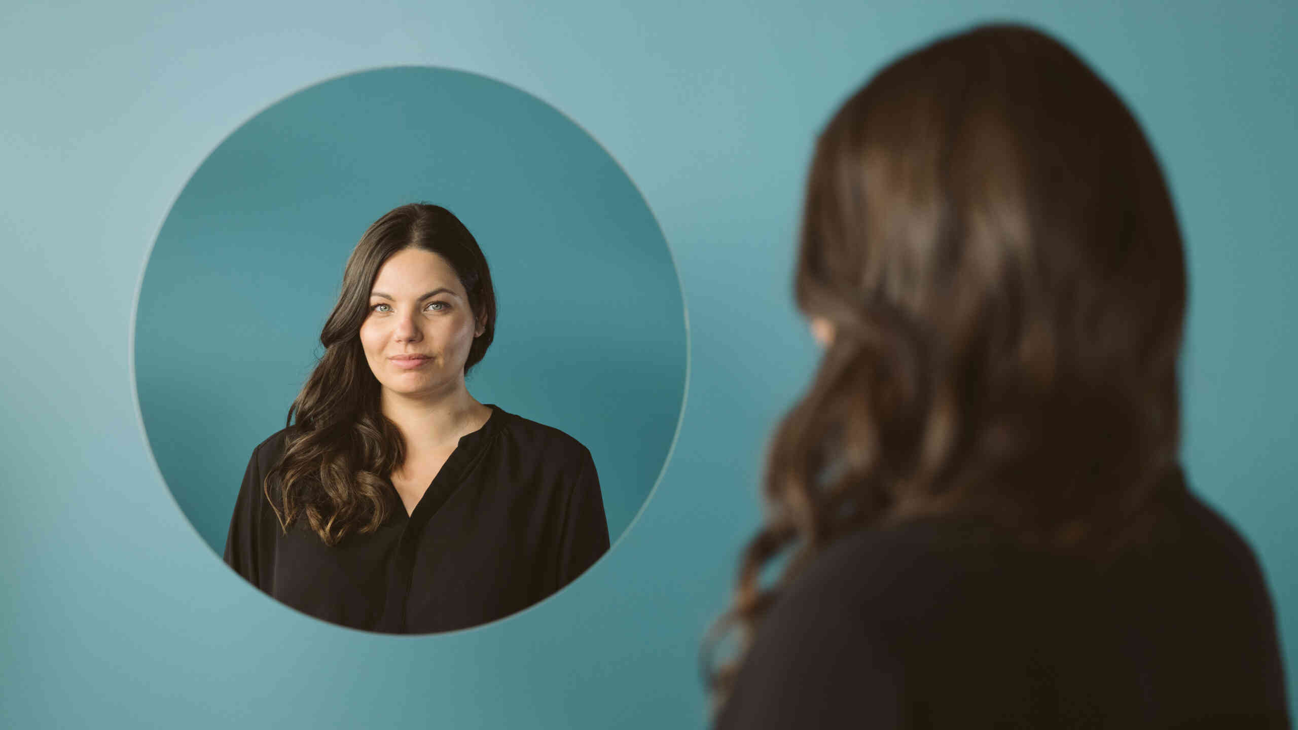
With the slogan 'Leadership. Starts with you' we realized their vision was not about teaching you new skills but 'giving back to you' that which is already 'in you' to help you become a better leader. The new vanHarte&Lingsma was both about a softer and deeper approach than most current leadership schools but, on the other hand, relentlessly confrontational. This was the reason for us to create an identity and campaign where (self)reflection became the key.
Symbolizing love and connectedness.
After exploring alternatives we decided that a softened restyled infinite heart would still be the best concept for their new logo, symbolizing love, interaction and connectedness.
Also the form language has its origin in the heart. One smooth line, this visual device symbolizes your learning path. A dynamic curved line, moving on the canvas.
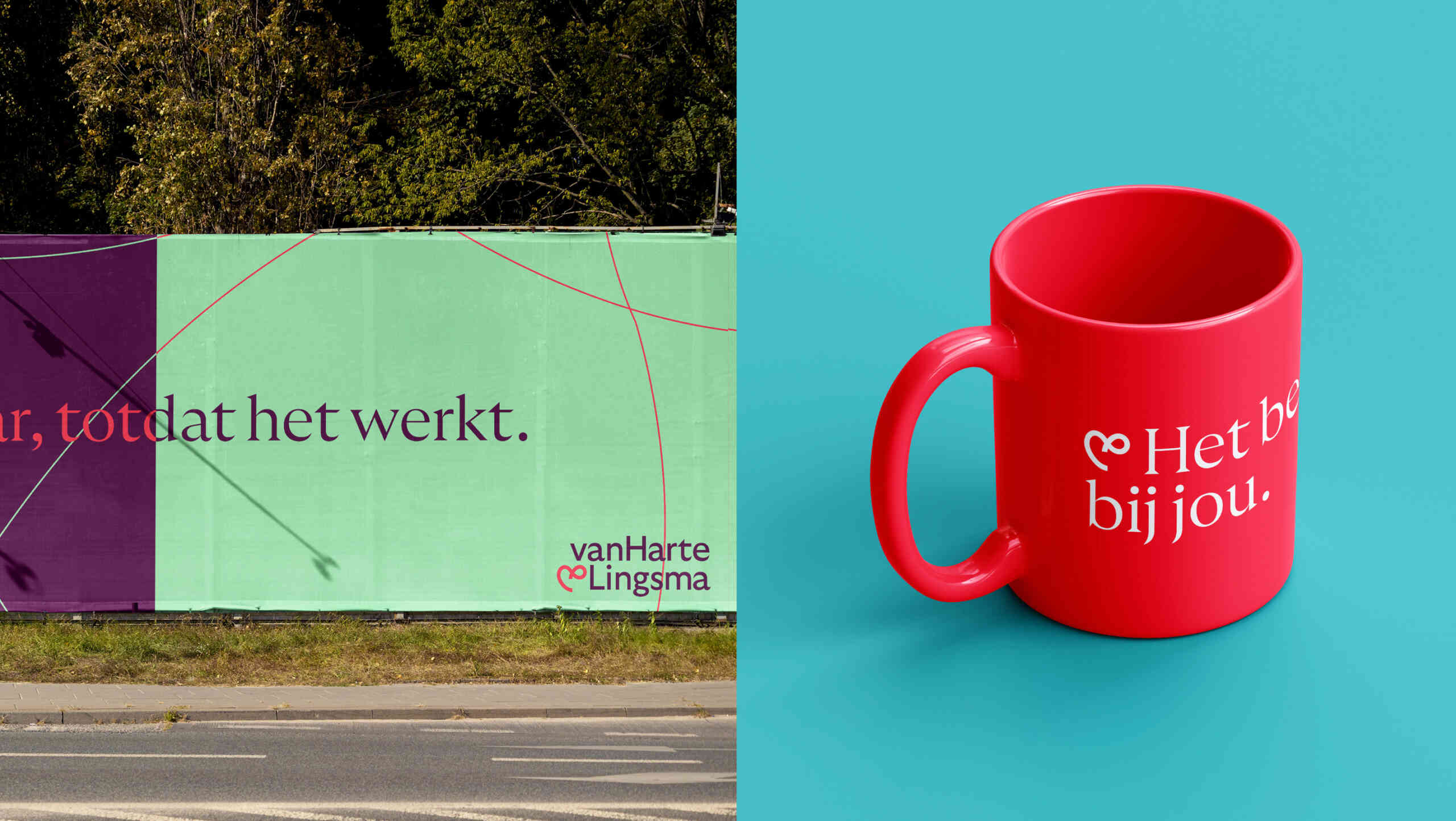
More than red
A renewed red still forms the companies primary colour and represents love, warmth and connectedness. We added a softer secondary colour palette, with aubergine, blue and sand to support the red. Each target group has its own colour combination to distinguish them in the variety of assets we created.
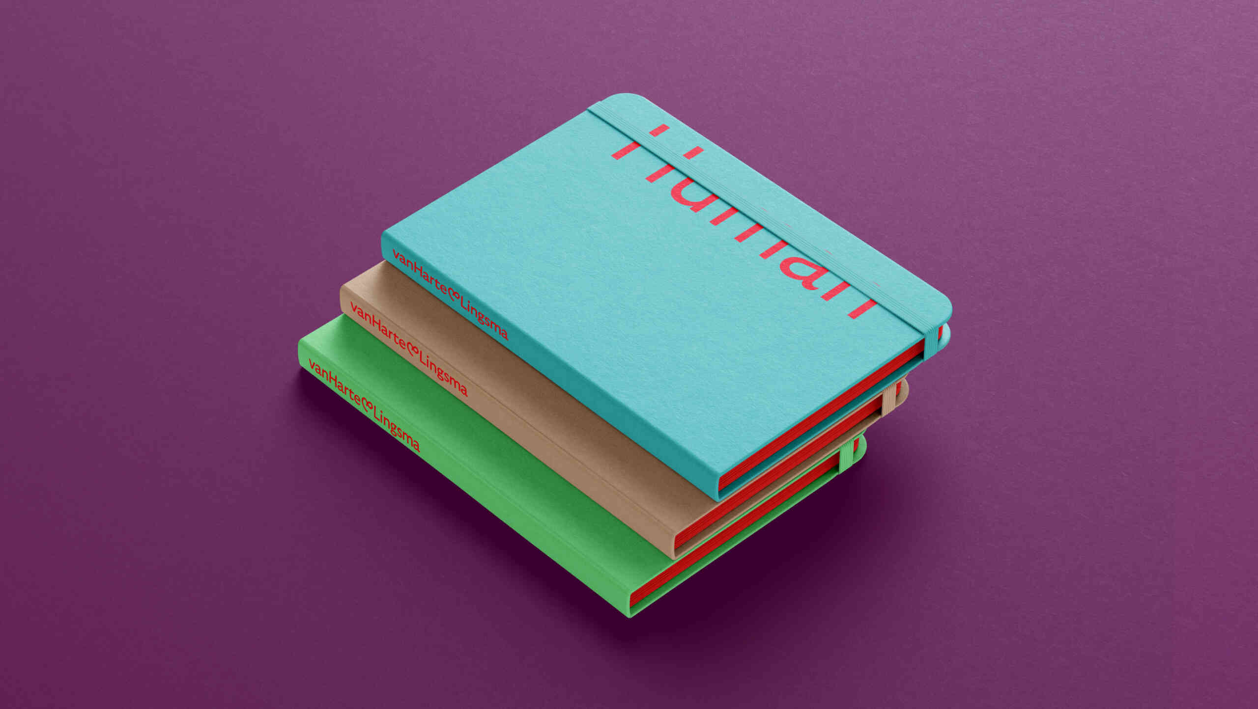
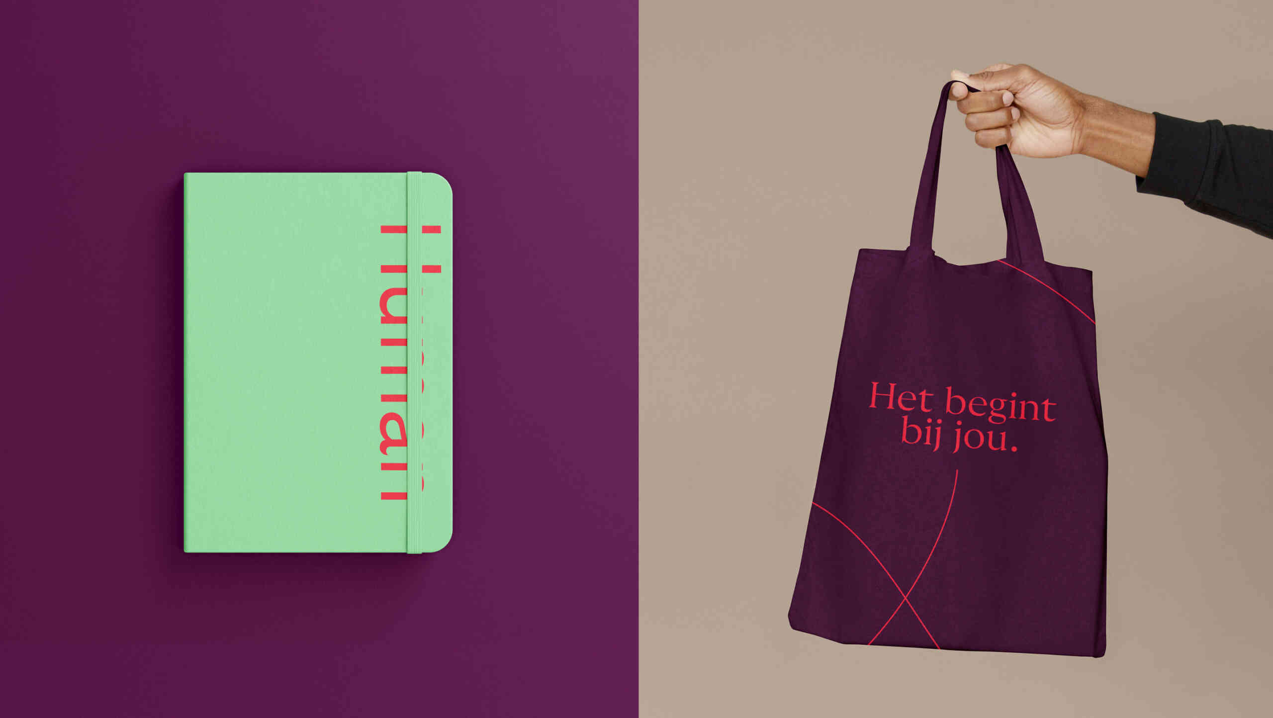
We designed a new website and brand story, established a new campaign based on (self)reflection using only real alumni as models for the campaign, mirror photos shot by Nanda Hagenaars and the videos shot by Studio HER. However not everything was digital: we also produced a new set of identity assets fitting a school, such as cards, notebooks, displays, brochures, certificates and binders.
Concept & Design: Dietwee
Strategy: Different Company, Fleur Greebe
Photography: NAN Photography, Nanda Hagenaars (reflections) and Danny Van der Elst (portraits)
Video: Studio HER
Illustrations: Timo Kuilder
Copy: ZegHert i.c.w. Dietwee, Different Company and vanHarte&Lingsma
Check the website of vanHarte&Lingsma here.